Data Visualization Explorations
Background
In June 2020, I began participating in a weekly data visualization challenge aimed at improving data wrangling and presentation skills. A subset of my work is presented here, but for further viewing see the below repositories for all of my visualizations with their respective R code. Each week, I aimed to try implementing a new type of chart, feature, or color palette to expand my coding skillset. Some of them took hours and some less than an hour depdening on the initial dataset and my goals for that week.
Github Repository of R4DS TidyTuesday attempts starting June 2020
Github Repository of my participation in the 30 Day Chart challenge
Project Year: 2020 - present
Selected Visualizations
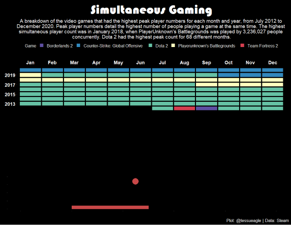
This plot utilized video game data from Steam. I looked across an eight year period (2012-2020) to explore the games with the highest number of players online at the same time. My design for this plot was insired by Atari’s Breakout game.
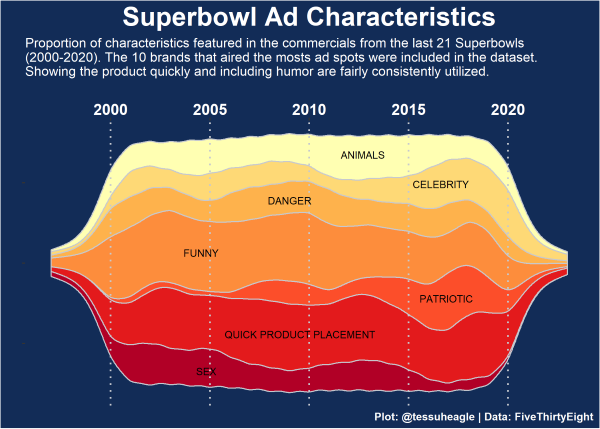
The next visualization used data from FiveThirtyEight looking at the content of commercials aired during the Superbowl. I wanted to try implementing a stream graph which is a type of stacked area chart, which is somewhat reminiscent of the shape of a football.
R has a built in package for data from the show Friends. It contains speaker and dialogue data broken down by season and episode. I tested out using a waffle chart to display the ratio of time each main character spent talking in each of the ten seasons.

This was my first ever attempt at making a map in ggplot and it was a frustrating and time-intensive plot. I used data on extinct plants and those at risk of extinction to visually explore where plants are under threat globally. I combined the map with a simple dot plot where I filtered for the top threats to endangered plants.

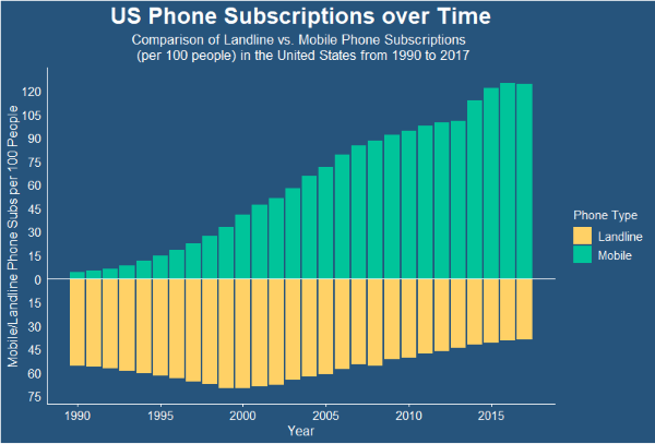
For this chart, I attempted a waterfall bar plot, where I mapped two variables against each other. The data looked at phone use over time broken down by mobile and landline subscriptions. As you can see, mobile use is increasing over time compared to a decline in landlines.
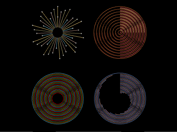
The following visualization was made as part of the 30 Day Chart Challenge. The prompt for this day was “experimental”. I had been wanting to test out different implemntations of coord_polar to explore circular visualizations of line plots.
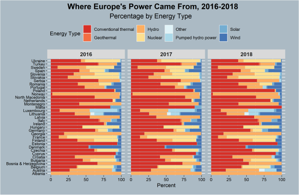
Using data on European country’s sources of power. I created a stacked bar plot that shows the distribution of power sources broken down by country. I faceted the plot to show the breakdown by year from 2016-2018. The goal of this was to show the changes in utilization of power sources over time.
